 |
 |
 |
 |
|
|||||||


 Similar Threads
|
||||
| Thread | Thread Starter | Forum | Replies | Last Post |
| [Now kind of Offical because Warmor made it] - Members you love on the forum | Warmor | RaNdOm iNsAnItY | 6323 | 07-22-2005 12:08 AM |
| Easier serch for members - For the forum | azncat | New features | 10 | 08-26-2004 11:42 AM |
| My new forum! - Looking for mods and active members! | HELLOTHERE | Links | 6 | 02-11-2004 11:34 AM |
| Members on the forum you hate or like | mysticveggeto | RaNdOm iNsAnItY | 58 | 10-29-2002 07:01 PM |
| simple question ? - there is 4175 members in the forum... | SSJKarma | General Comments and Strategies | 5 | 05-15-2002 10:25 PM |
 |
 |
|
 |
 05-05-2005, 01:36 AM
|
#11 |
|
Banned
Senior Member
 Post Thanks / Like
Points: 0
Mentioned: 0 Post(s)
Tagged: 0 Thread(s)
Quoted: 0 Post(s)

|
Well that's nice to hear..yo dudes.
When The comcis come out..you may see me turn some of you into sprites... Actually would some of you post some sprites in this thread.....of how you'd be represented... just describe I'll alter it somewhat... to match your personality. |

|

|
|
05-05-2005, 01:42 PM
|
#12 |
|
Senior Member
Senior Member
Post Thanks / Like
Points: 0
Mentioned: 0 Post(s)
Tagged: 0 Thread(s)
Quoted: 0 Post(s)

|
I'm cool, and i like the shadow (imma a ninja :biggrin
 turn me into a sprite....
__________________
[img:sig_uid]http://img.photobucket.com/albums/v249/coolroms/spawn.jpg[/img:sig_uid] |
|
|
|
|
05-25-2005, 10:25 AM
|
#13 |
|
Banned
Senior Member
Post Thanks / Like
Points: 0
Mentioned: 0 Post(s)
Tagged: 0 Thread(s)
Quoted: 0 Post(s)
|

|
|
|
|
|
05-25-2005, 11:37 AM
|
#14 |
|
Senior Member
Junior Member
Post Thanks / Like
Points: 0
Mentioned: 0 Post(s)
Tagged: 0 Thread(s)
Quoted: 0 Post(s)

|
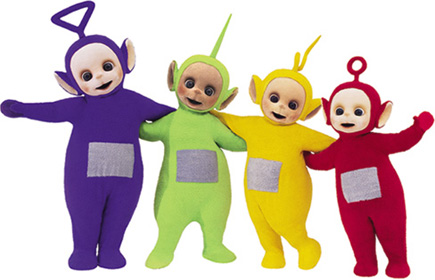
I hope im not the first to notice but , those tings are based on teletubbies huh ?
__________________
[img:sig_uid]http://img.photobucket.com/albums/v466/-Cypher-/banner4.jpg[/img:sig_uid] |
|
|
|
|
05-25-2005, 12:11 PM
|
#15 |
|
Senior Member
Senior Member
Post Thanks / Like
Points: 0
Mentioned: 0 Post(s)
Tagged: 0 Thread(s)
Quoted: 0 Post(s)
|
lol especially the red one, with the circle on top.
wha-! i just relized also the yellow one. i think they are based off of the teletubbies
__________________
CLICK THIS NOW, CLICK IT, CLICK! please: http://kevan.org/brain.cgi?shingko |
|
|
|
|
05-25-2005, 12:29 PM
|
#16 |
|
Senior Member
Senior Member
Post Thanks / Like
Points: 0
Mentioned: 0 Post(s)
Tagged: 0 Thread(s)
Quoted: 0 Post(s)
|
[quote
 ost_uid0="Virtual Fighter"]telletubies?[/quote] ost_uid0="Virtual Fighter"]telletubies?[/quote]tinkiweenky! Dipsy! yaya! hoe! telitubbys say hello ehoh!
__________________
[img:sig_uid]http://animegifs.free.fr/anime/naruto/page7/naruto126.gif[/img:sig_uid] |
|
|
|
|
05-25-2005, 01:14 PM
|
#17 |
|
Senior Member
Senior Member
Post Thanks / Like
Points: 0
Mentioned: 0 Post(s)
Tagged: 0 Thread(s)
Quoted: 0 Post(s)

|
The last picture is a recolor of Dr. Doppler, the main bad guy (Besides Sigma) from Mega Man X3.
__________________
If I don't respond to any IM's, I'm at work, so josh.maxwell@brinker.com, and I can e-mail you back almost immediatly. [img:sig_uid]http://i2.photobucket.com/albums/y19/warmor/warmorsig1.gif[/img:sig_uid] Created by: TremulantX |
|
|
|
|
05-25-2005, 03:59 PM
|
#18 |
|
Senior Member
Senior Member
Post Thanks / Like
Points: 0
Mentioned: 0 Post(s)
Tagged: 0 Thread(s)
Quoted: 0 Post(s)
|
Haha cool. You really need to work on two things:
1) Contrast between the colours. 2) Shading. Let's start with talking about the shading. The type of method you're using has been affectionately named, by the pixel art minority, Pillow Shading. Now, Pillow Shading is where you have no specific light source and you colour inside the outlines and continue inward, like a lighter extension of the outline itself. It is mostly used by those who are new to pixel art, but in fact, it should not be used at all. It is very unrealistic and, yeah ... it looks very very bad. Tips on how to fix it -Define a light source. Draw a circle for where you want it to be, if that helps. -the shading should be on the opposite side of the object from where the light is projecting. Okay, now it's time to talk about the contrast between the colours ... the colours you're using to shade are way to close to the colours of the outlines. It just basically looks like the oulines are really thick and it adds no depth. So you should try to find a happy medium between the two colorus. The shading colours could even stand to be closer to the base colours if you like. Thank you for your time. |
|
|
|
|
05-25-2005, 05:09 PM
|
#19 |
|
Banned
Senior Member
Post Thanks / Like
Points: 0
Mentioned: 0 Post(s)
Tagged: 0 Thread(s)
Quoted: 0 Post(s)
|
[quote
ost_uid0="Razz"]Haha cool. You really need to work on two things:1) Contrast between the colours. 2) Shading. Let's start with talking about the shading. The type of method you're using has been affectionately named, by the pixel art minority, Pillow Shading. Now, Pillow Shading is where you have no specific light source and you colour inside the outlines and continue inward, like a lighter extension of the outline itself. It is mostly used by those who are new to pixel art, but in fact, it should not be used at all. It is very unrealistic and, yeah ... it looks very very bad. Tips on how to fix it -Define a light source. Draw a circle for where you want it to be, if that helps. -the shading should be on the opposite side of the object from where the light is projecting. Okay, now it's time to talk about the contrast between the colours ... the colours you're using to shade are way to close to the colours of the outlines. It just basically looks like the oulines are really thick and it adds no depth. So you should try to find a happy medium between the two colorus. The shading colours could even stand to be closer to the base colours if you like. Thank you for your time.[/quote] I see *takes notes* Well I'm using the basic paint program. You are correct I am new to pixels..and I didn't establish the correct shading. *nods* I'll try hardier razz and your advice was read an enhaled. |
|
|
|
|
05-25-2005, 05:19 PM
|
#20 |
|
Member
New Member
Post Thanks / Like
Points: 0
Mentioned: 0 Post(s)
Tagged: 0 Thread(s)
Quoted: 0 Post(s)
|
[quote
ost_uid0="SBYRD5"][/quote]since when does yellow, represent shadow?
__________________
[img:sig_uid]http://img.photobucket.com/albums/v249/coolroms/chun.jpg[/img:sig_uid] Bring it... |
|
|
|
|
«
Previous Thread
|
Next Thread
»
 Linear Mode

|
|
